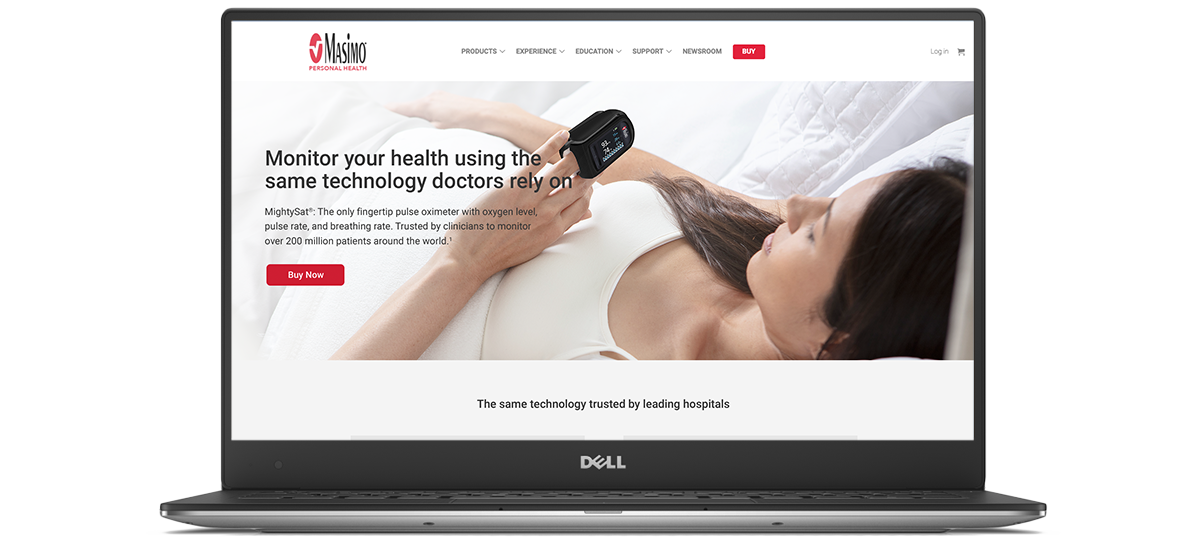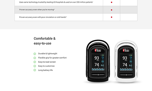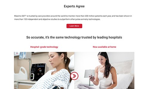
The website was originally built by a third-party agency and was only recently brought in-house after being moved to Shopify. The consumer-centered website allows Masimo's medical-grade technology to be sold direct to consumers without a prescription. The product selection has grown over the last one to two years and the website needed to expand with it.
Numerous redesigns have been completed since initial involvement on this site, but the most recent ask came as a result of consumer testing. Site organization, checkout experience, and load times were causing high bounce rates and low product sales.

New website navigation reorganization, smoother or fewer clicks to complete checkout experience and decrease page load times. Product Detail Pages (PDP) and Product Landing Pages (PLP), required new designs to layout copy hierarchically, reduce unnecessary copy and eliminate carousels based on statistical feedback.
Clearly defined target audience from research and user groups.
Every decision including imagery, copy, and overall design, was brought back to the focus group findings along with a defined project brief.


Other at-home Pulse Oximeter devices, especially others with lower price points.
Price is the main competitor used against the device as the website and advertising needed to correctly define quality and the accuracy story other devices could not prove.
Similar information should be seen in its entirety without scrolling, such as in a slide format from desktop down to mobile. Identify web page with always accessible purchase button. Product trust marks.
Additional design requirements were discussed and decided between my Director and me.
Overall project goals were achieved.
Updating the color scheme was going to be an uphill battle with needing c-suite approval, but in the end, the muted color palette we launched with left the web pages missing the mark.
Copyright © 2021 Christina Jensen Designs. All rights reserved.